DoNthg. App
Do Nthg. is a digital wellness app that helps students overcome burnout by reframing rest as purposeful. It promotes mindful breaks, playful reflection, and community connection- making rest intentional and guilt-free.
Role
Team Lead
(Team Of 03)
Timeline
10 weeks
Type
UX|UXR|UI
Tools
User Research Synthesis, Branding& Integration,
Prototyping, Design Systems Development.
Challenge
Overworked university students faced constant academic pressure, burnout, and decision fatigue, leaving little mental space to pause or rest. Productivity apps worsened overwhelm instead of supporting balance, recovery, and sustainable focus.
Approach
We researched student fatigue patterns and designed a minimalist productivity experience that normalized rest. By reducing choices, simplifying task flows, and introducing gentle reminders, the app supported focus without guilt or cognitive overload.
Result
The solution helped students regain control of time and energy, improving clarity, reducing mental load, and enabling healthier productivity habits. Users completed tasks faster while feeling calmer, supported, and less pressured.


The Problem
University students face relentless academic pressure, time constraints, and a culture that glorifies productivity. Despite understanding the need for rest, many feel guilty or unproductive when taking breaks. Existing wellness initiatives often add to stress by turning self-care into structured tasks, further overwhelming students instead of helping them truly recharge.
Most Common observations

How Might We?
Help students see rest as a valuable and necessary part of productivity rather than a distraction from it?
Reduce the guilt students feel when taking breaks and encourage mindful, restorative downtime?
Design low-pressure experiences that ease stress instead of adding to students’ workload?
Ideation: Opportunity Areas


Information Architecture
The information architecture organizes app content into clear, intuitive pathways -connecting rest, play, and community features seamlessly to support effortless navigation and purposeful engagement across all user touchpoints.

Low Fidelity Developments
Early wireframes explored layout hierarchy, content placement, and navigation flow; allowing rapid ideation and feedback before investing in visual design.
Mid Fidelity Developments
Refined prototypes focused on structure, usability, and interaction clarity; translating core features into cohesive, testable user journeys for further iteration and validation.
User Testing
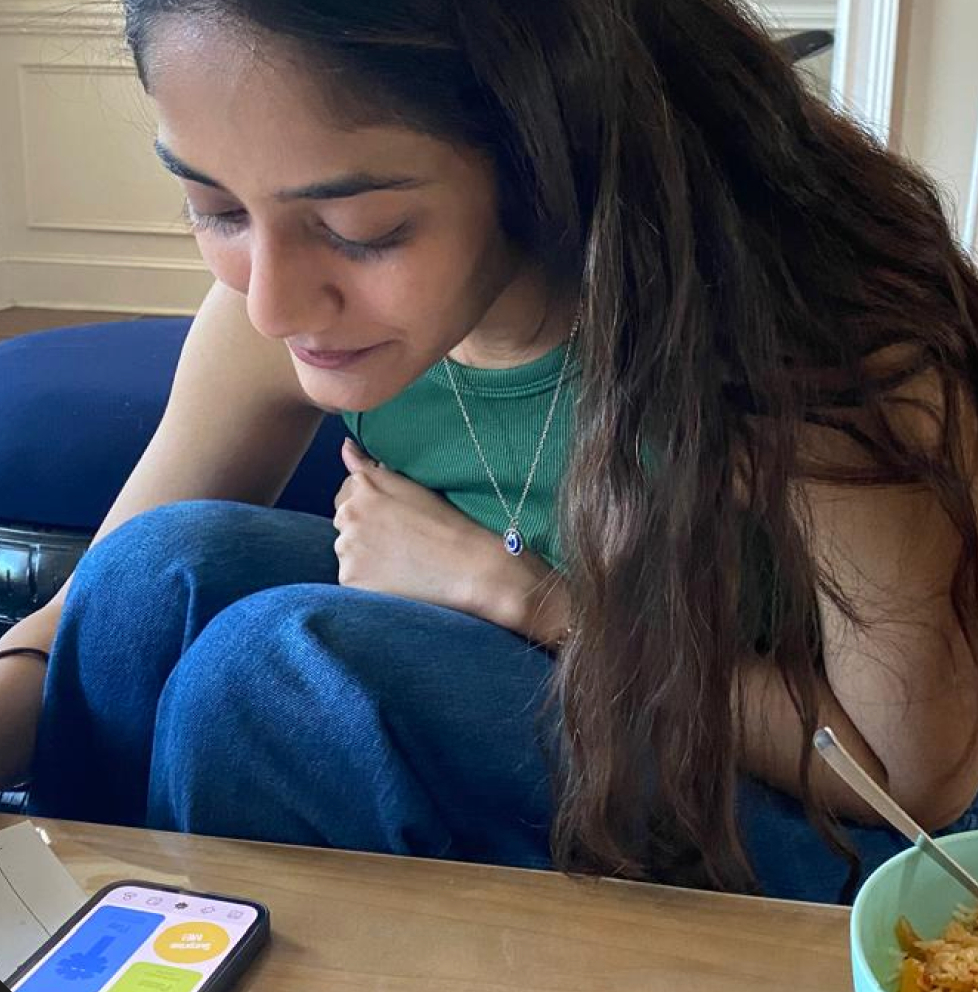
We conducted user testing with university students to evaluate usability, emotional resonance, and clarity of navigation. Through think-aloud sessions and task-based scenarios, we identified friction points in feature discovery and onboarding. Feedback helped refine copy tone, streamline interactions, and ensure the app genuinely fostered relaxation without feeling like another productivity tool.

Usability Testing
Observed users completing tasks to identify friction and improvements.

Group Testing
Collected shared feedback through collaborative task-based discussions.

Interviews
Explored user motivations, behaviors, and emotional connections in depth.

Key Take-aways
Key usability insights revealed navigation gaps and engagement barriers impacting experience.


My Experience
Working on Do Nthg was a deeply reflective and fulfilling experience that reshaped my understanding of how design can influence emotional well-being. Designing for “rest” was paradoxically challenging—it required slowing down while working within structured design sprints. Translating an abstract concept like guilt-free rest into tangible interactions pushed me to think beyond aesthetics and focus on emotional resonance. Collaborating across research, branding, and UX streams helped me balance empathy with precision, ensuring every decision aligned with the brand’s calm yet playful essence. Seeing the product evolve from insights to an interactive prototype made me appreciate how design thinking can humanize technology, transforming it into a sanctuary rather than a system.
Challenges Faced
1. Balancing simplicity with engagement.
2. Maintaining consistent brand voice across all touchpoints.
3. Designing interactions that evoke rest without feeling empty.
Key Learnings
1. Testing and re-iterating for clarity and emotion.
2. Seamlessly integrating brand identity into the app experience.
3. Building a thorough, user-centered information architecture.


